Wayfair
Servicebase Pattern Library
Creating reusable design patterns for 20+ customer and agent workflow products
Overview
We streamlined Wayfair’s service workflows by unifying agent and customer-facing experiences into a single, scalable platform.
By introducing reusable design patterns, we reduced design and engineering maintenance costs and improved efficiency while allowing for seamless customization across different user groups.
Timeline
Sept. 2020 - Feb. 2024
My Role
Design Lead
Creating, managing and championing library
Responsibilities
UI inventory
UI research + creation
Usability testing
Implementation QA
Sticker sheet definition
Figma migration
Library management
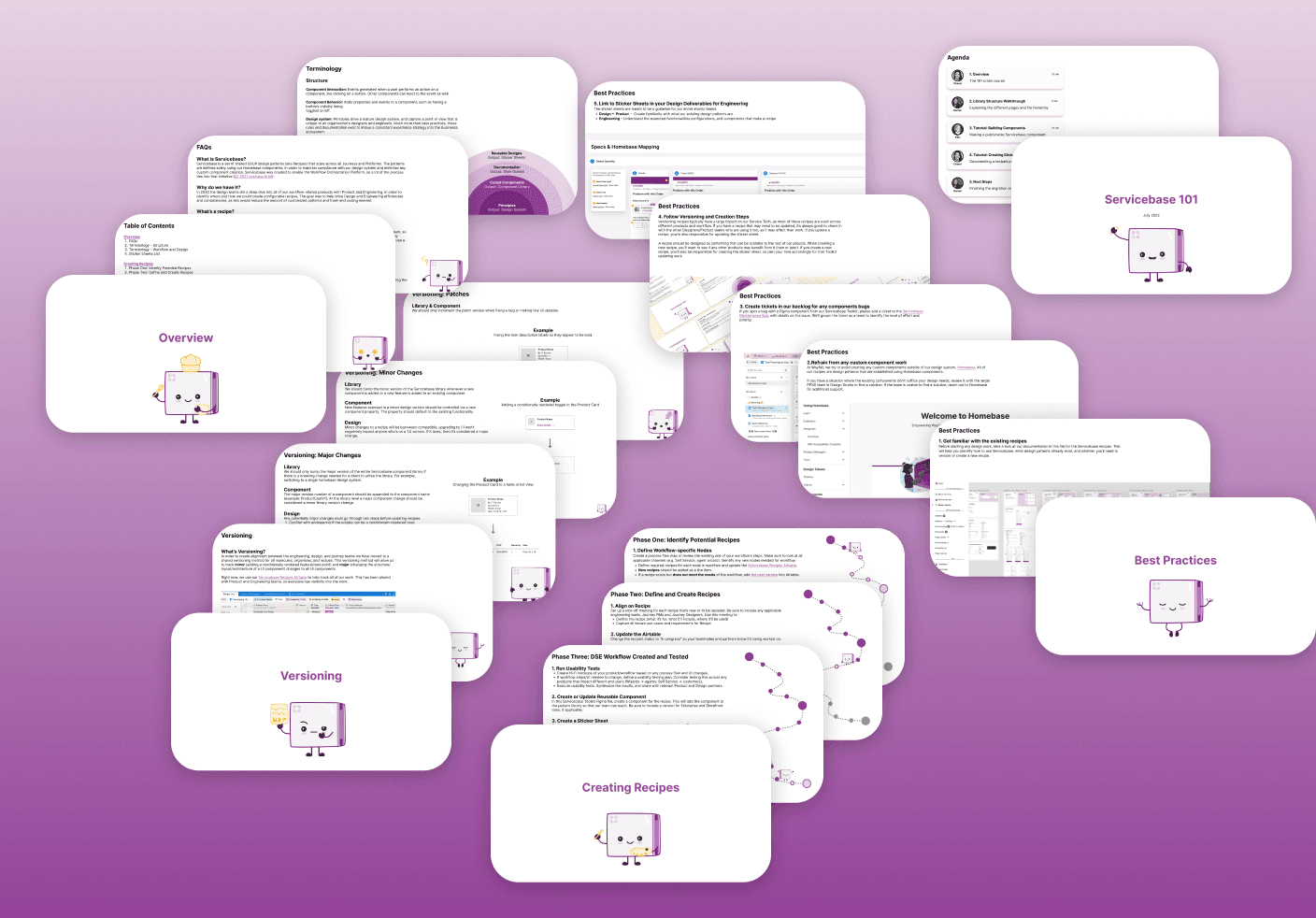
Onboarding documentation
Oversee contractors
Team
5 product designers
1 Engineering Team
Platform
Web
Discover
Background
Wayfair's Service Tech teams used to worked in silos with split responsibilities for agent-facing and customer-facing experiences. Despite similar processes for both user groups, we had different products for each.
Our teams took on a large-scale initiative to migrate all workflow products to a new platform with a single workflow base that caters to both customer and agent experiences.
The Problem
Our products lacked cohesive design patterns due to a siloed working model, resulting in higher design and development efforts and costs.
Insights
💔 Siloed projects led to fractured, inconsistent experiences and design patterns across different service tools.
🖥️ Changes in workflows required significant engineering effort due to tightly integrated technology.
Design Goal
Create and maintain a set of shared design patterns and templates that scale across all Post-Purchase product journeys and platforms.
Define
Our Process
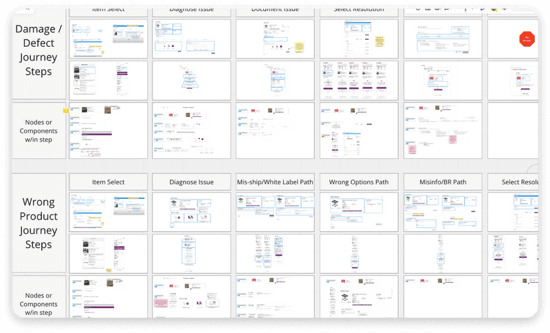
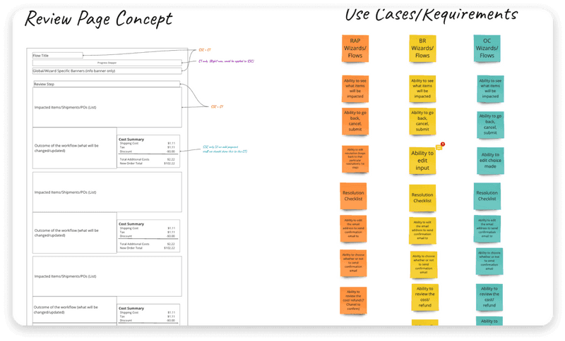
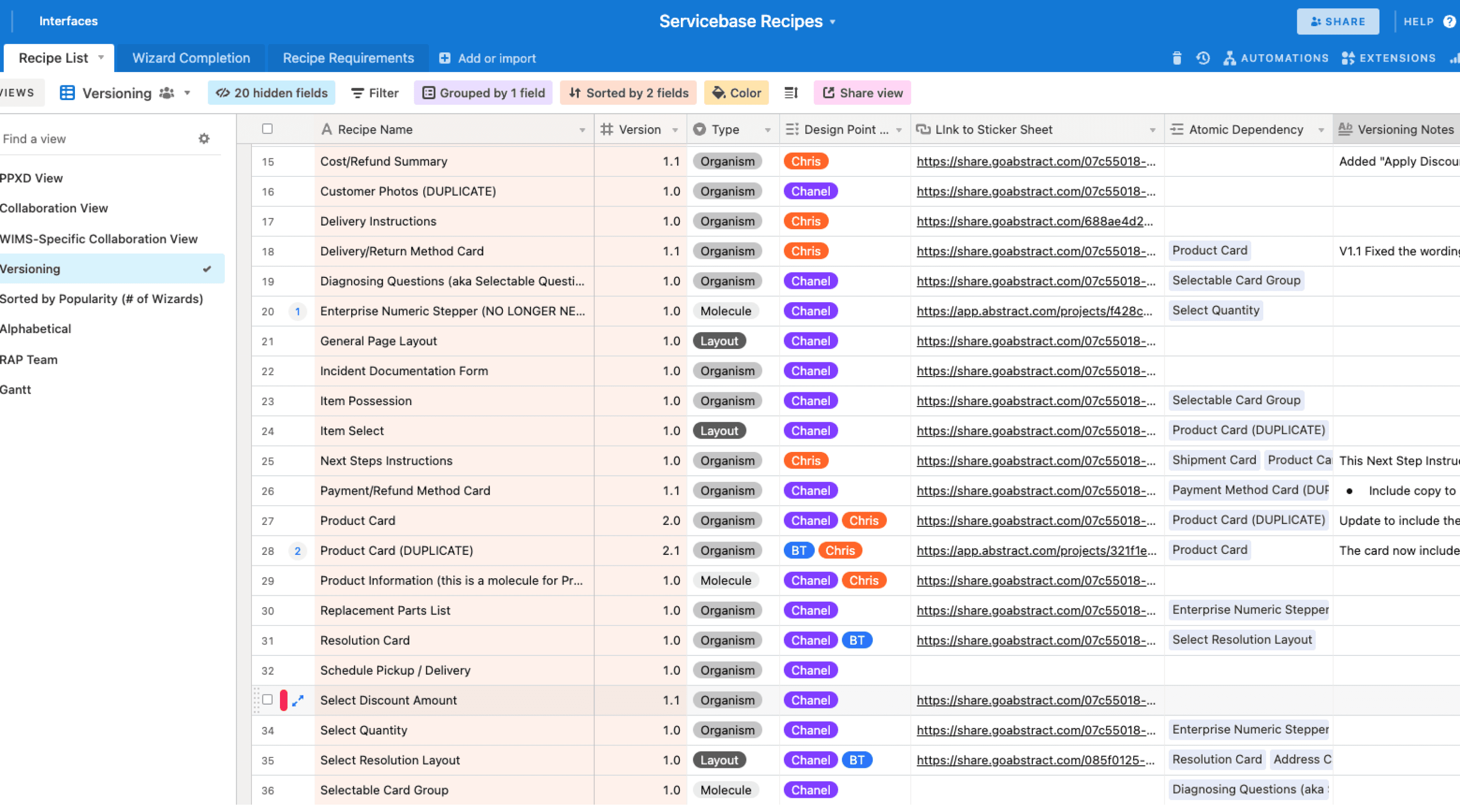
Our design team identified 35+ design patterns by mapping workflows in Miro and tracked progress in Airtable for transparency with our product and engineering partners.
After aligning on concepts, we built a pattern library in Sketch with documented, reusable components.
During the migration initiative, we incorporated these new patterns into usability testing sessions and refined them in weekly critiques.
Our Approach
📋 Define Our Process
Collaborate with product and engineering to establish guidelines for creating, versioning, and maintaining our design patterns in Storybook.
🗺 Map the Existing State
Audited all screens across our products to identify overlapping design patterns, highlighting use cases and unique conditions.
🎨 Create Design Patterns
After identifying potential patterns, we distributed them across our team for concept exploration. We aligned on new "recipes" through regular check-ins with partners and validated them with iterative usability testing.
👩🏻🏫 Share and Educate Team
I organized a presentation and demo to onboard and empower our new teammates.
Develop
Figma Migration
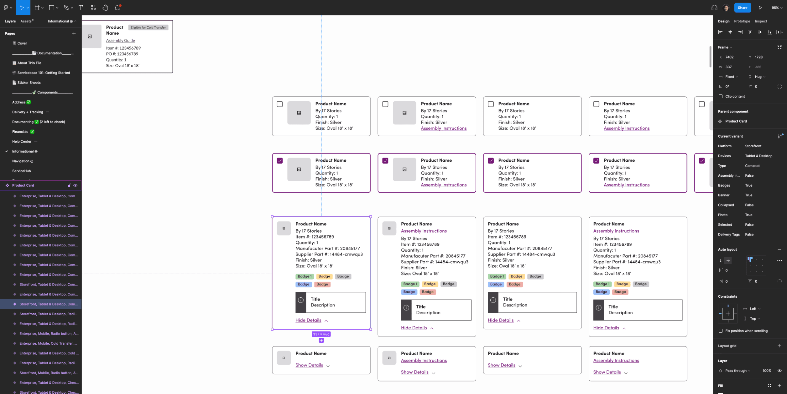
When we began this journey, Wayfair was still using Sketch + Abstract for our design tools. In 2021 Wayfair began transitioning to Figma, which meant the design system would no longer be supported in Sketch. It was crucial for us to rebuild pattern library over in Figma since it uses the Homebase Design System as our foundation.
As the design system team created a unified Figma library aligned with code assets, I led the initial rebuild of our pattern library while balancing other projects. Later, new teammates joined, allowing me to oversee their work and contribute as needed.
Always Evolving
Wayfair thrives on iteration, and our pattern library evolved over four years.
Initially, we rebuilt it in Figma as a direct 1:1 from Sketch, later enhancing it with booleans and responsive components.
Over time, we realized the components were taking up too much space in design files. Collaborating with contractors, we refined the library into V2—streamlining variations, removing unnecessary booleans, and simplifying themes to reduce file size.
Deliver
Solution
The Workflow Platform utilizes new, reusable design patterns that can scale for all workflow products while being re-themed for customer and agent experiences.
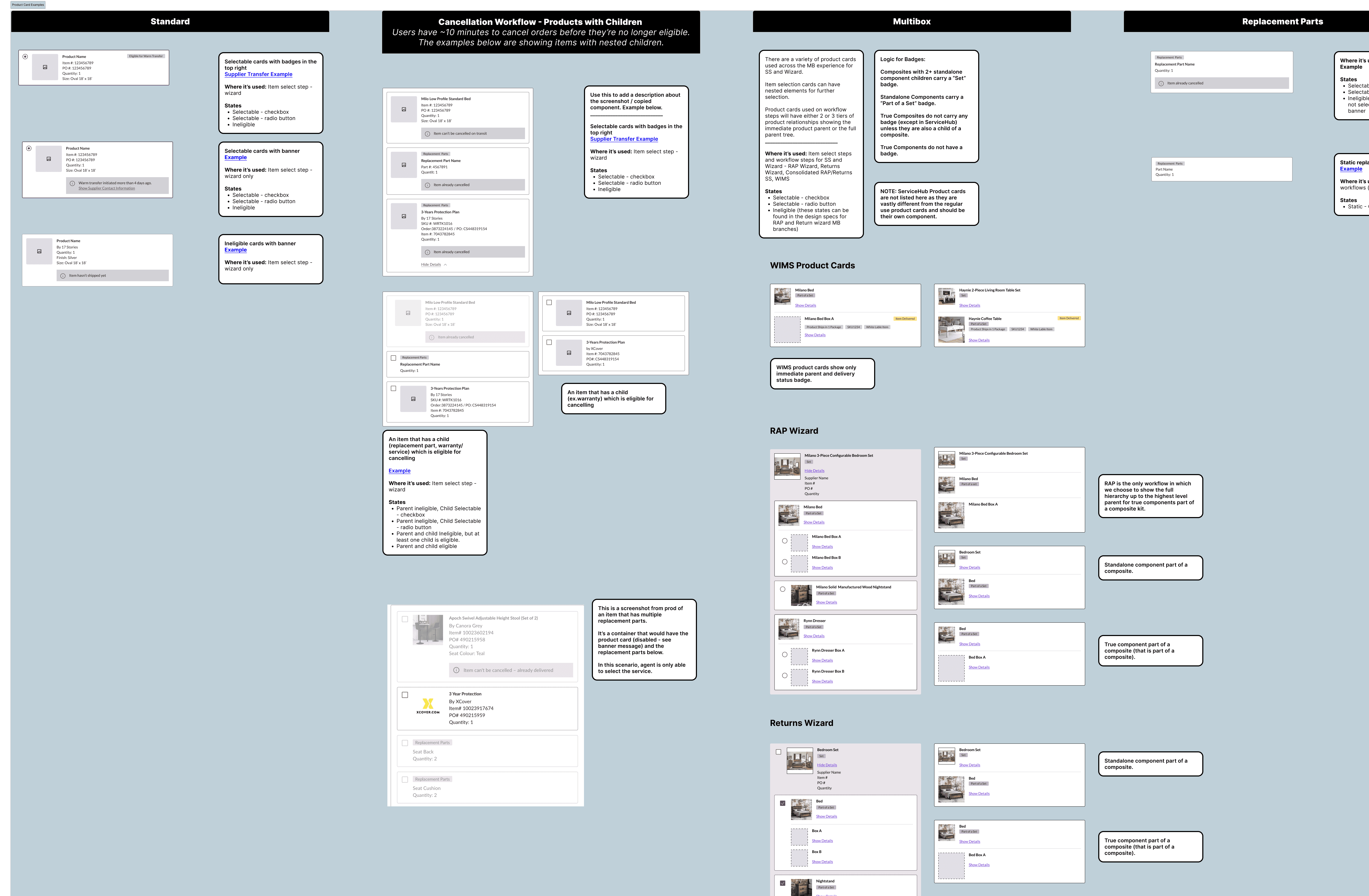
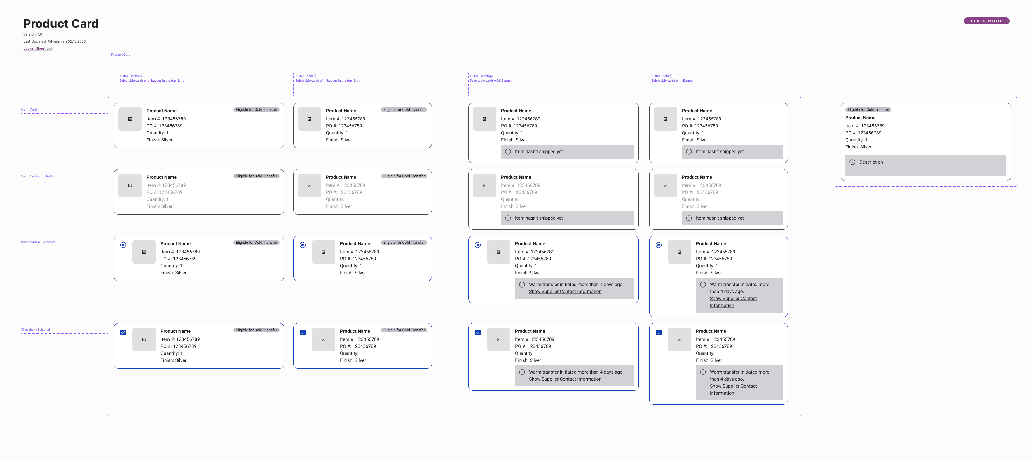
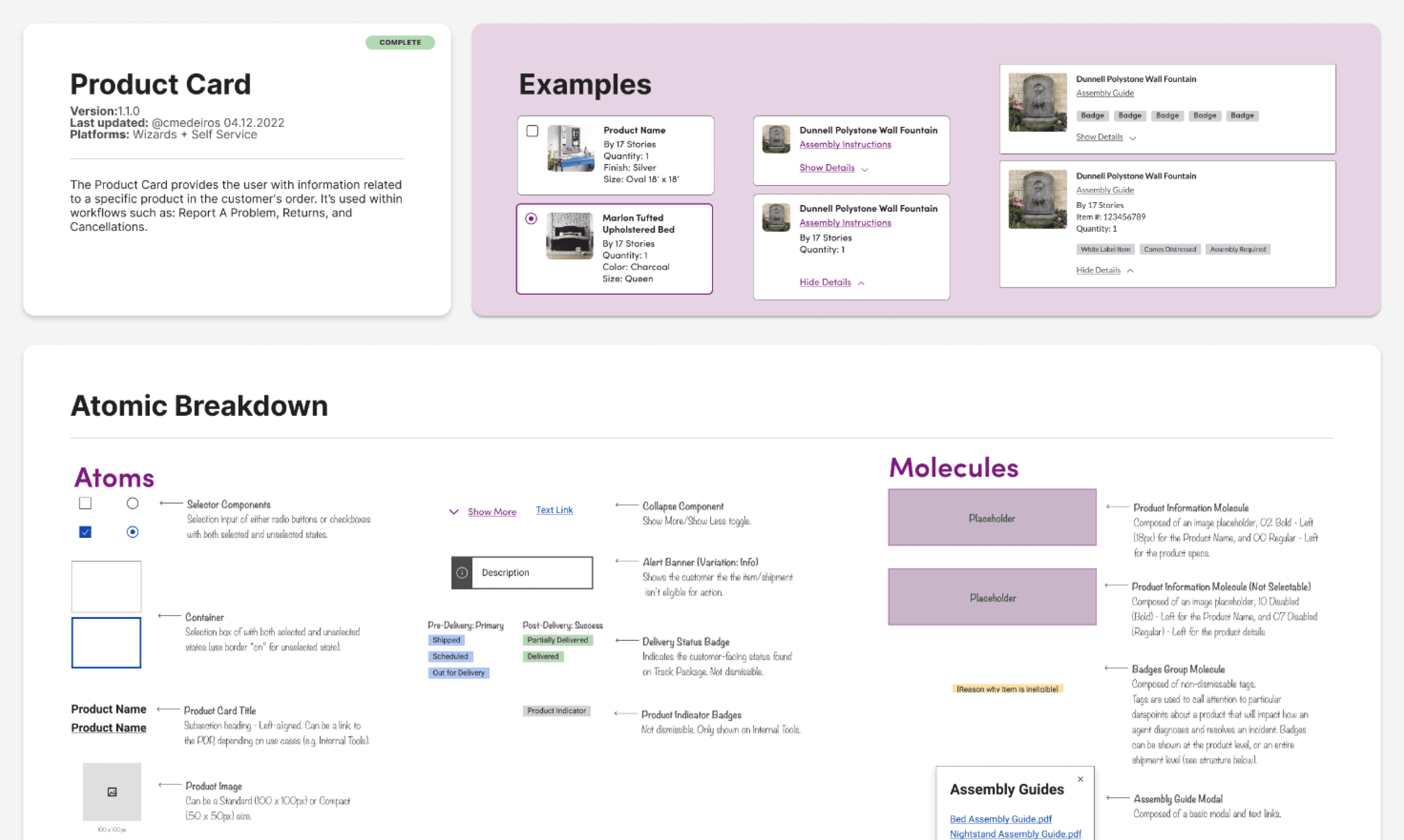
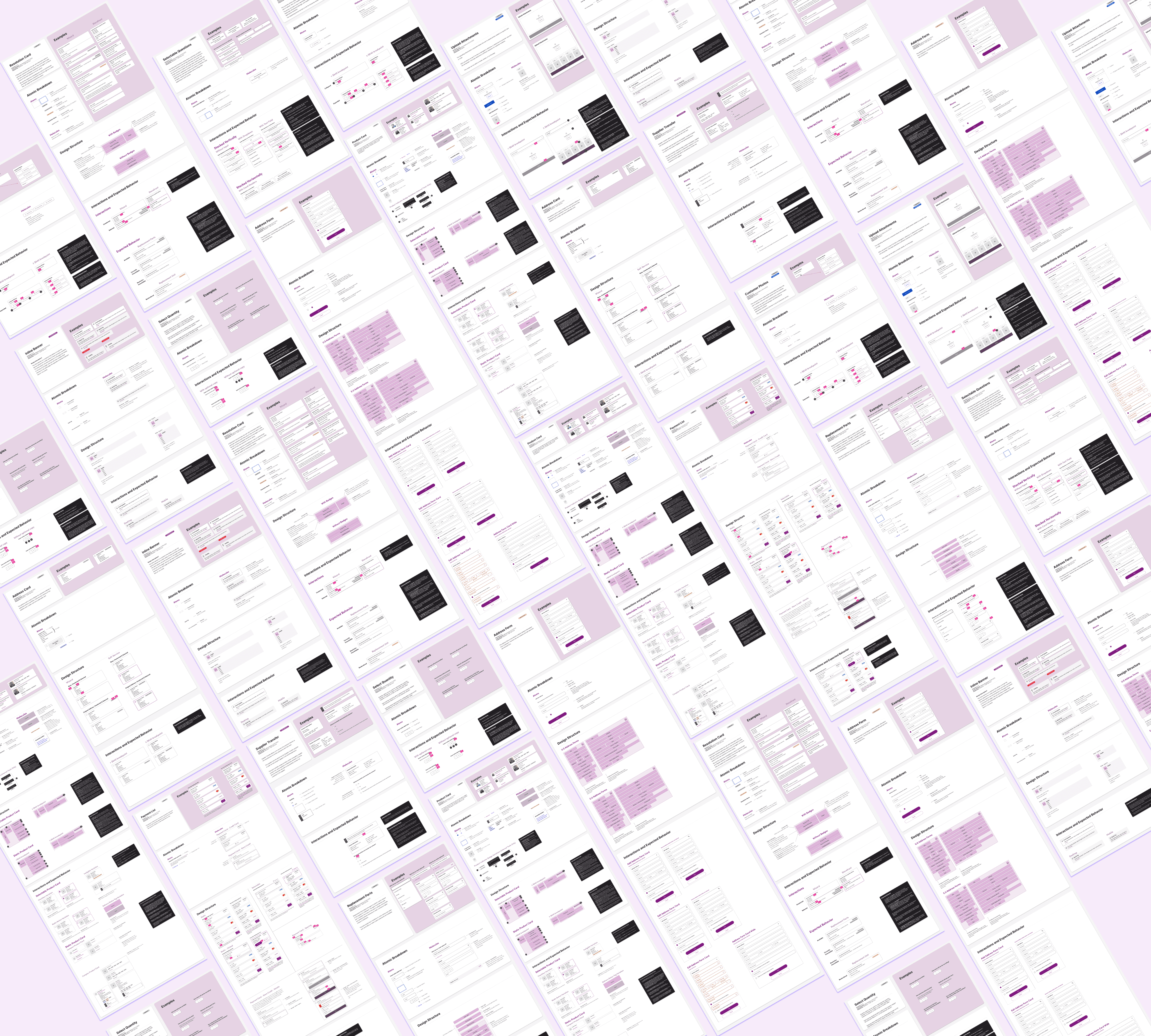
We created documentation for each pattern, focusing on callouts for engineering on design and interaction specifics, so that the final product would be closely aligned to design expectations.
Documentation Approach
⚛️ Atomic level breakdown
What components from our larger design system were being used, and any relevant aspects or features.
🏗 Design structure
How the more complex design patterns should be containerized to ensure build matches design requirements.
🤳🏻 Interaction behaviors
How certain aspects of the patterns should function based on different conditions.
📊 Examples of various states
How the components would look across agent and wizard experiences in different states.
Design Deliverables
loading
loading
.
.
.
.
.
.

